Moulvi — Brand Identity & Website Case Study
Overview
Moulvi is a modest menswear house from Dhaka for the man who dresses with purpose. It offers panjabis for everyday and occasion wear, alcohol-free attars and Eid & wedding gift boxes, all under one line: “Style with Sunnah.”
We built the brand from the ground up: strategy, logo, visual identity and real-world applications, collected in a 27-page brand guidelines book, plus the design of the online store.
The Challenge
Traditional menswear is often sold with loud sales and heavy decoration. Moulvi wanted the opposite: to make modest dress feel premium, personal and effortless for the modern Muslim man. The brand had to:
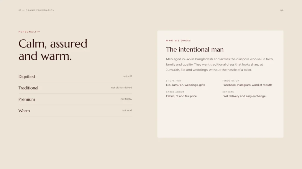
Speak to men aged 22–45 in Bangladesh and across the diaspora who value faith, family and quality
Feel dignified but not stiff, traditional but not old-fashioned, premium but not flashy
Work across three lines, clothing, fragrance and gifting, from a shirt label to a website
Respect faith and never use it as a sales trick
The Solution
We started with the foundation, then built a complete identity system on top of it:
Brand foundation → Mission, vision and four values (Modesty, Craft, Sincerity, Purity), a calm, assured and warm personality, and a voice that speaks softly and clearly: “A quiet maroon for your Eid morning,” never “HUGE EID SALE!!!”
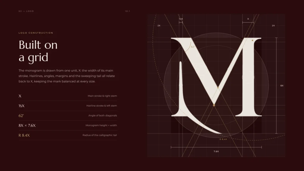
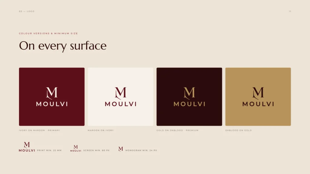
Logo → An M monogram with a sweeping calligraphic tail, drawn on a grid from one unit (the width of its main stroke) with 62° diagonals, so it stays balanced at every size. It comes as a full lockup, a horizontal signature and a standalone monogram.
Applications → Labels and swing tags, packaging, stationery, social media templates and the website, each with clear rules so the brand looks the same everywhere.
Color Palette
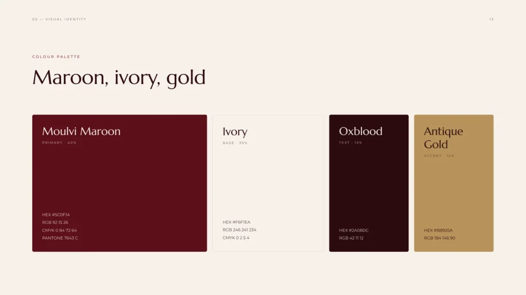
Moulvi Maroon (#5C0F1A) leads the palette as the primary colour, on a soft Ivory (#F6F1EA) base. Deep Oxblood (#2A0B0C) carries the text, and Antique Gold (#B8925A) is kept for small accents such as foil and highlights. The palette comes with set proportions (40 / 35 / 15 / 10) so layouts always feel rich but quiet.
Typography
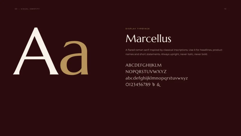
Headlines use Marcellus, a flared roman serif inspired by classical inscriptions: always upright, never italic, never bold. Montserrat handles body text and small spaced-out labels, giving the serif a clean, modern partner.
Packaging & Social Media
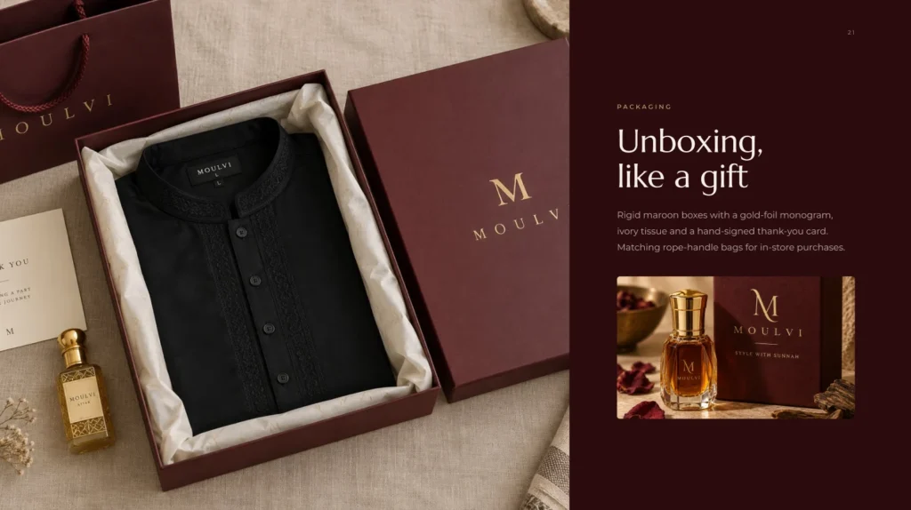
Rigid maroon boxes with a gold-foil monogram, ivory tissue and a hand-signed thank-you card turn every order into a gift, with matching rope-handle bags for in-store purchases.
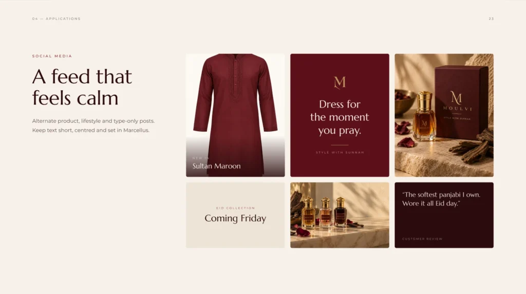
On social media, the feed alternates product, lifestyle and type-only posts, with short, centred text set in Marcellus, so it feels calm instead of crowded.
The Website
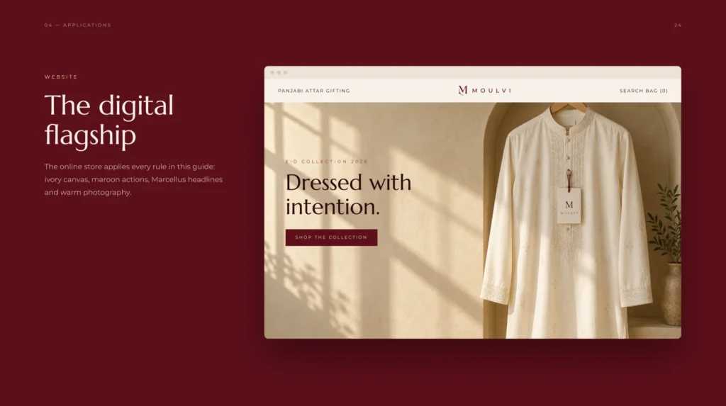
The online store is Moulvi’s digital flagship and applies every rule in the guide: an ivory canvas, maroon buttons, Marcellus headlines and warm, natural-light photography. Simple navigation by Panjabi, Attar and Gifting keeps shopping easy.